Full-stack web app for analysing house-search data
Allows users to find information about an area that might be relevant while house-searching. This includes information on recent property sales, local amenities, transport links and more.
Client
Portfolio Project
Year
2026
Tech stack
The Problem
This project was born from an issue I had myself when I recently began house-searching.
I wanted to know about property prices in that specific area, if they were selling well, and what the local amenities were like (shops, green spaces, etc). I also wanted to know if it had good transport links.
It’s possible to find all this information online, but it’s scattered across multiple sites and is time-consuming to lookup manually.
Project Purpose
I decided to create a single web app that would bring all this information together in one place.
I wanted this project to be an opportunity to explore data-dense interface design, presenting a large amount of data but still being easy to navigate and use. This would be applicable to other data-heavy applications, such as those used in finance, healthcare and defence.
In these environments, users rely on their tools to make decisions, so clarity, scannability and trust in the data matter more than minimalistic design.
The Solution
I designed and built a web app that compiles public datasets and presents them on an interactive map and dashboard.
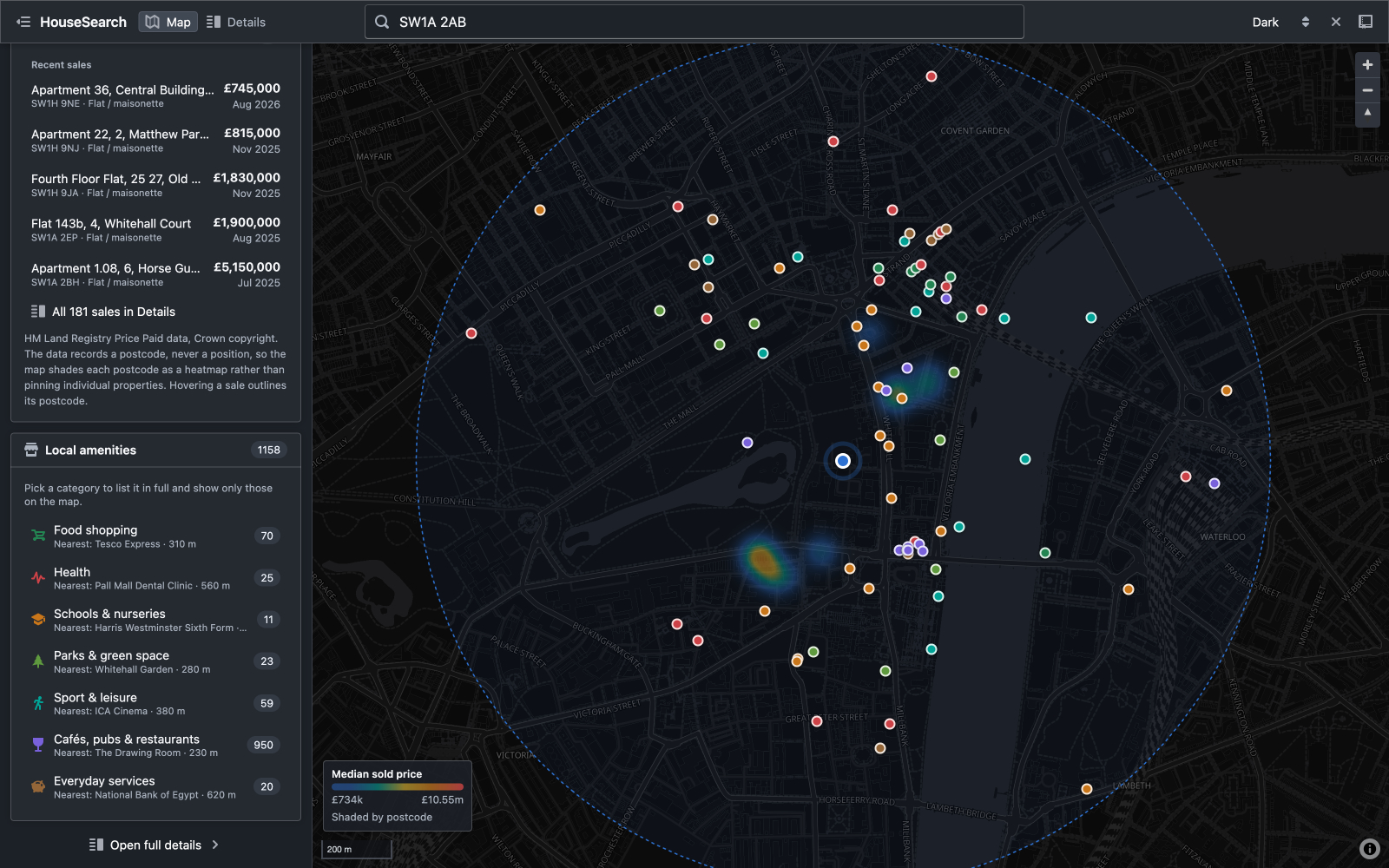
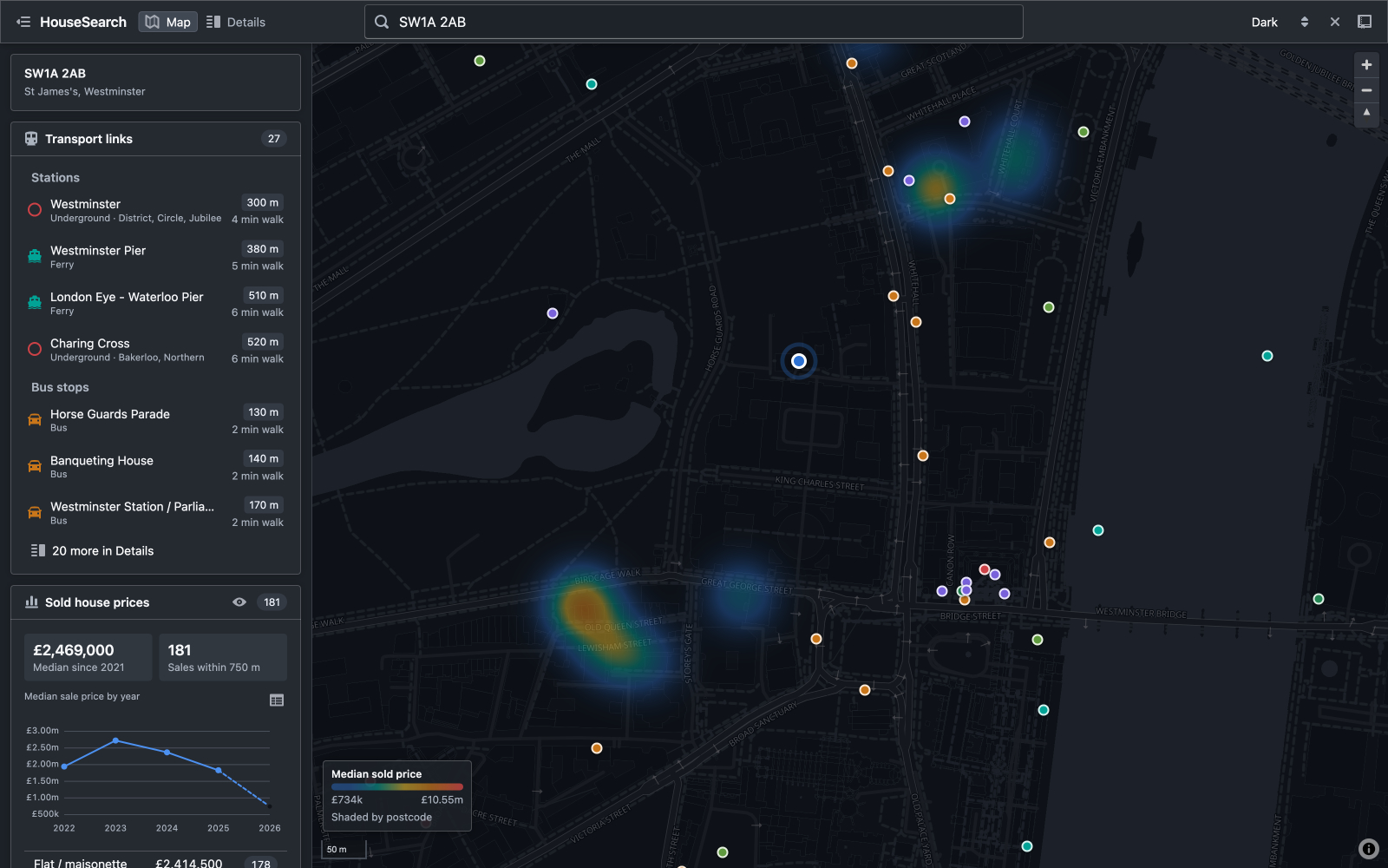
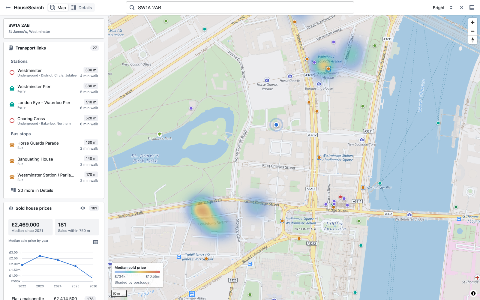
Map view
For getting a feel for an area at a glance. It shows a search radius around the chosen postcode, with local amenities plotted as colour-coded markers and a heatmap for property sale prices.
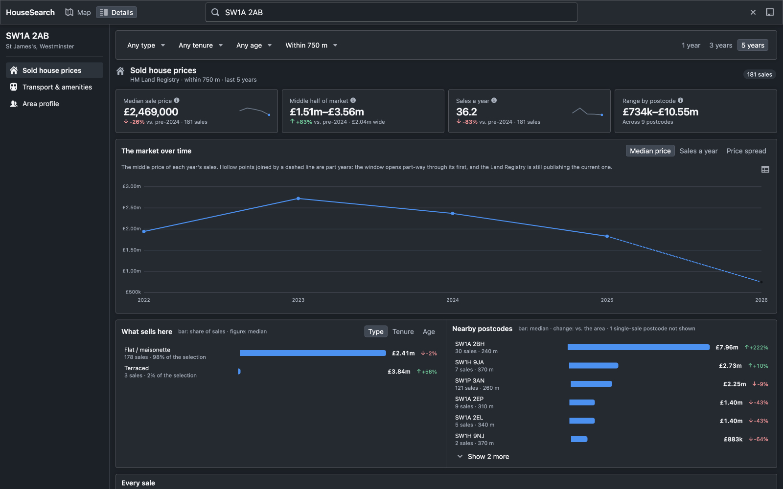
Details view
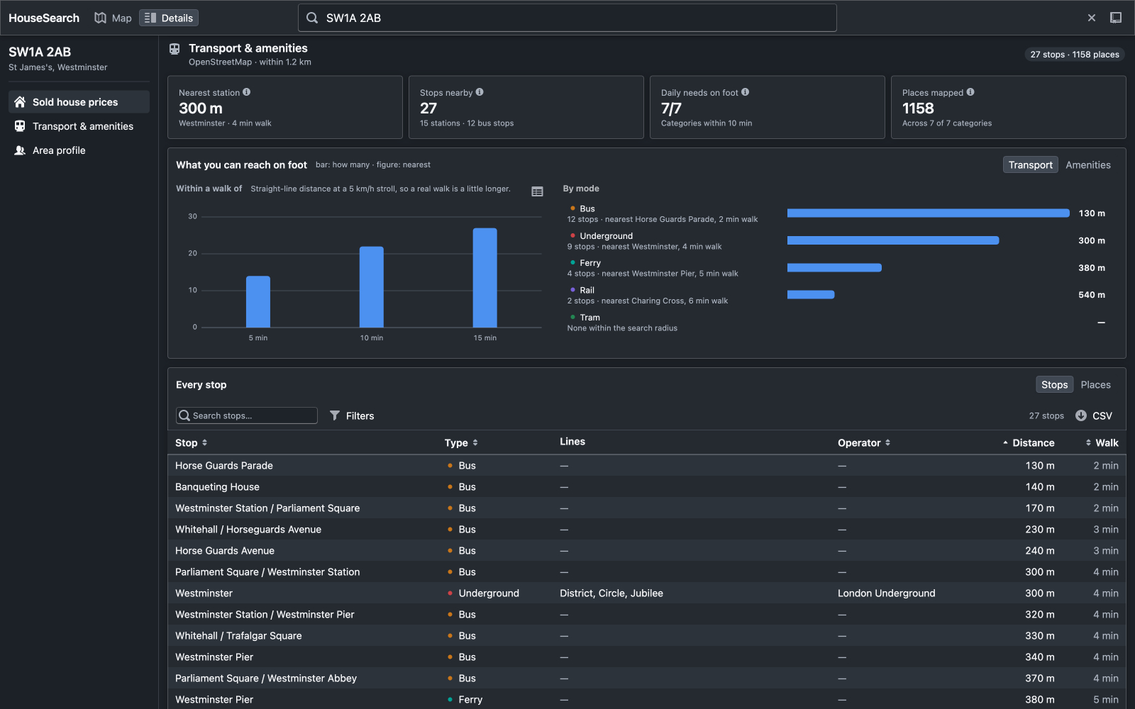
A dashboard for users who want to dig into the numbers. It is split into three sections, navigated from a sidebar:
- Sold house prices: key figures and charts for viewing prices in the area and over time.
- Transport and amenities: a summary of the nearest station, number of stops nearby and how many daily-needs categories are within a 10-minute walk.
- Area profile: wider context on the area, including data such as internet speeds, crime stats, etc.
UX & Design Decisions
As this app is designed for technical users, it has some different design considerations from a typical consumer-facing app. Users will value detail over simplicity and want more information to make informed decisions.
I made some design decisions aimed at making dense information easy to scan, compare and trust.
-
Progressive disclosure: each section opens with a row of key figures, followed by charts, then the full records. Users can stop at whichever level of detail they need.
-
Contextual information: every key figures should include additional context, such as a comparison (e.g. change versus last year), a sparkline for trend, or an info tooltip explaining how the figure is calculated.
-
Semantic colouring: colours are used consistently to provide meaning at a glance. For example, delta arrows use green and red arrows to show increases and decreases.